Be found
Make the brand easier to discover across search, AI answers, referrals, and the places people already look before buying.
The goal is not only to look good. It is to become easier to find, easier to trust, and easier to choose.
Make the brand easier to discover across search, AI answers, referrals, and the places people already look before buying.
Help visitors quickly understand what you offer, who it is for, and why your work is worth paying attention to.
Create a first impression that feels credible, premium, and aligned with the level of the business behind it.
Turn stronger attention into better inquiries, clearer decisions, more conversion, and a website that supports growth.
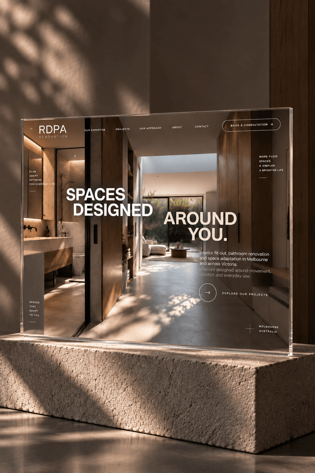
Selected website directions shaped around clearer positioning, sharper visual rhythm, and a more premium way to enter the brand.
The full Services page explains each entry point in more detail. On the homepage, the role is simpler: make it obvious that the work starts with the friction, not a generic package.
You do not need to arrive with the perfect package in mind. We start with what feels unclear, under-trusted, or hard to sell, then shape the right direction from there.
The brand has taste, but people still need too much context to understand the offer.
We clarify the positioning, message, homepage angle, and the words the website needs to repeat.The work is strong, but the website does not reflect the quality, pricing, or confidence behind it.
We strengthen the first impression, page structure, proof, and visual system so the brand feels easier to trust.People like the product or service, but the next step still feels vague, slow, or too easy to postpone.
We refine the product story, calls to action, reassurance, and path from interest to enquiry or purchase.A few notes from brand and website projects shaped around stronger identity, clearer structure, and a more elevated first impression.
The new direction gave the brand a much stronger editorial presence online. The website felt more distinctive, more intentional, and far more aligned with the visual world we wanted to communicate.
What stood out most was the sense of refinement in the final result. The site felt calmer, more architectural, and much more coherent as a digital extension of the studio.
The new website direction made the studio feel more considered online. It gave the projects more space, clarified the philosophy, and created a calmer way for people to enter the work.
Start a conversation
GAIRA STUDIO
Not always. Sometimes the smartest move is a clearer e-commerce path, a sharper website structure, or stronger visual direction. The scope depends on what is blocking trust, traffic, or conversion right now.